Driving +30% more engagement by demystfying gut health
About project
Tiny Health is a family gut health testing platform. The goal of the project was to shift NPS and engagement by transforming user understanding.
Team
Founders
Product & Design Lead (me)
Part-time Product Manager
Science Lead
Developers
Business Challenge
"How do you explain complex medical results to the average parent in an empathetic way?"
Tiny Health's microbiome testing platform was providing overwhelmingly complex results to parents seeking simple answers about their children's health conditions. With 72% of users coming to the platform specifically to address conditions like eczema, allergies, and digestive issues, the existing scientific-heavy interface was creating barriers instead of solutions.
How
Complete summary redesign
I conducted a comprehensive user research audit and applied a first-principles approach, developing a "3As framework" (Acknowledge, Address, Act) that restructured the entire information architecture around user concerns rather than raw data. Working as the sole designer with our 5-person dev team and input from our 35+ person company, I redesigned the core results experience and implemented it in phases over Q2 2025.
Key Metrics
Engagement score (views of key pages)
NPS
Resample & repurchase rates
My role
Product & Design Lead
As Product & Design Lead, I served as the sole designer and collaborated with our part-time PM, project manager, and dev team of 5. I also worked cross-functionally with the research and clinical teams to create a more intuitive user experience.
Who I collaborated with
Full team collaboration
This screen is the main user experience of our product; therefore I got input from the entire team (35+) to ensure we built the correct flow.
Discovery & definition
Users needed clarity on actions, not a science textbook.
How
Audit of user data & interviews
The team and I gathered feedback from our users about the existing report and its painpoints. We utilized in-app surveys, feedback received by our customer service, and user interviews.
Defining our scope & goals
Worked with founders and team leads to define the goals for this project:
- Increase user understanding of their results
- Reduce confusion and overwhelm
- Impact our user metrics to drive business outcomes
Findings
Parents needed a summary-first approach
"I want to know what's wrong and what I should do about it, but I'm lost in all these percentages and bacteria names." - Parent of 2-year-old
"I spent 30 minutes trying to find the recommendations. Why isn't this the first thing I see?" - New parent
Concerned parents represented 72% of users
- Find solutions to their child's existing symptoms
- Take immediate action to see health improvements
- Understand the "why" behind recommended changes
The existing product was designed for a scientific audience but needed to serve busy parents seeking clear guidance.

Painpoints
1. Information overwhelm
Parents were completely overwhelmed with the sheer amount of information presented on the first screen.
2. No clear summary / takeaway
While there was a lot of info, it was not summarized in a digestible way.
3. No conditions information
The conditions that parents had gotten the product for were not mentioned.
Audit: Before
Organized by scientific category
Ideation & concepting
I set out to answer user questions with the 3A approach.
How
Lo-fi diagrams of key user questions in order

First principles approach
Started from the fundamental question "What does a concerned parent actually need to know?" rather than "How do we present all our data?" to rebuild the experience from the ground up.
3As Emotional Framework
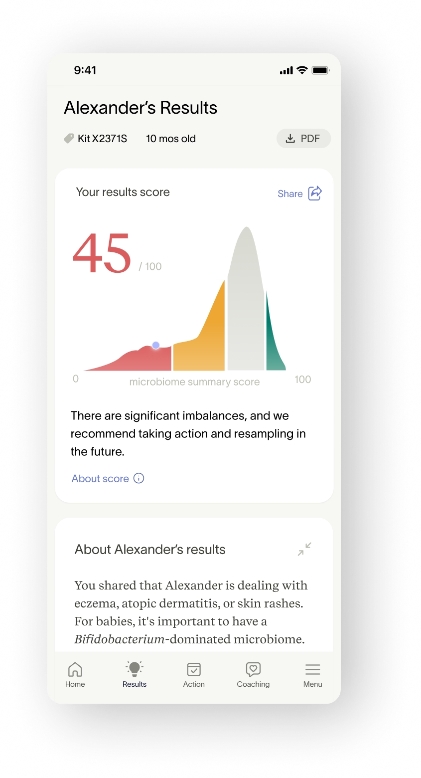
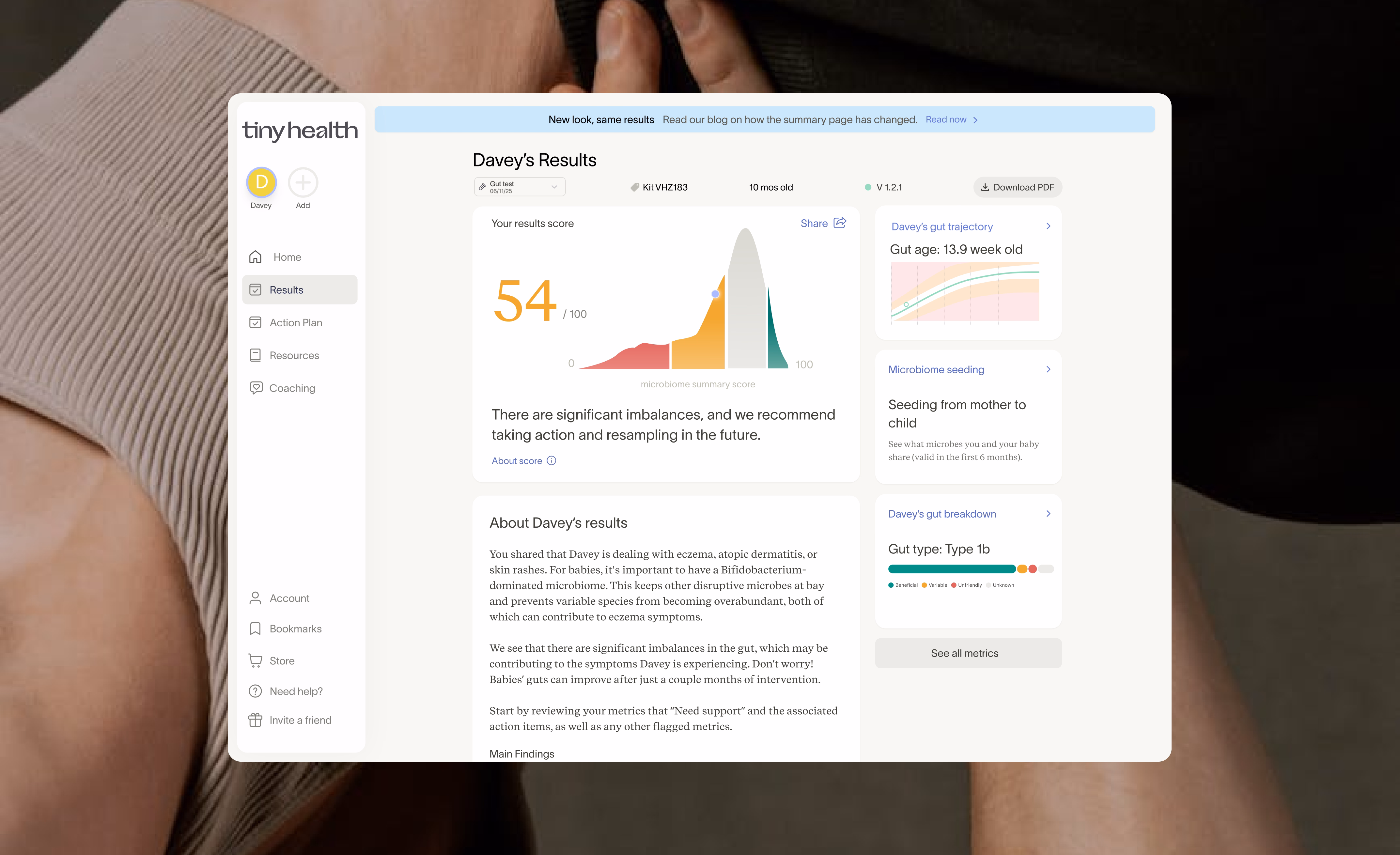
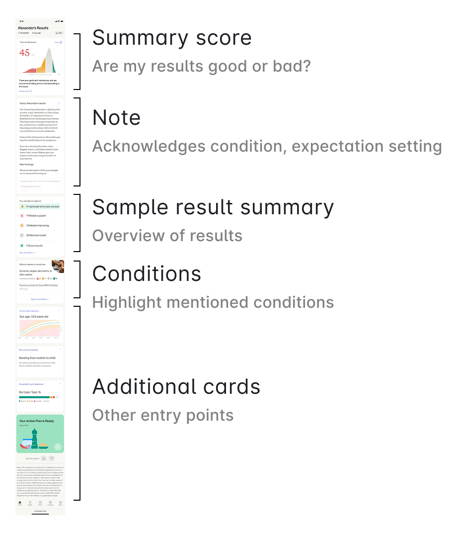
Designed with a framework to Acknowledge users' stated concerns, Address how their results connect to those concerns, and provide clear Actions they could take, moving from validation to understanding to empowerment.
Information Architecture Redesign

Visual hierarchy
Before
After
Evaluation & testing
The release would need significant communications and product marketing.
How
Working prototypes sent to users
Figma prototypes sent to users for feedback, followed up by interview sessions.
Internal release
Released the feature first to a handful of internal beta testers to validate it and squash any remaining bugs before rolling out.
Findings
Users appreciated the new layout
The beta testers found that the new layout provided much more context and they understood their results better. It took some adjustment for users who had already seen their results to reorient around where content lived.
Practitioners' workflow would be impacted
Practitioners who view patient results needed a substantial walkthrough to avoid confusion on first open. We delayed launch by a week to prepare email comms, video walkthroughs, and in-app product marketing.
Final designs & implementation
Flow
Progressive disclosure of the right info
How
Figma file with designs
Figma file containing all user flows, screens, edge cases, prototypes, and copy needed for implementation.
Assisting developers with implementation
I helped developers maintain implementation quality, testing every screen in sandbox before production.
Feature flags
The redesign was implemented in phases over Q1-Q2 2025, with careful attention to preserving existing functionality while improving UX. We used feature flags to test approaches and gradually roll out changes.
Highlighted features
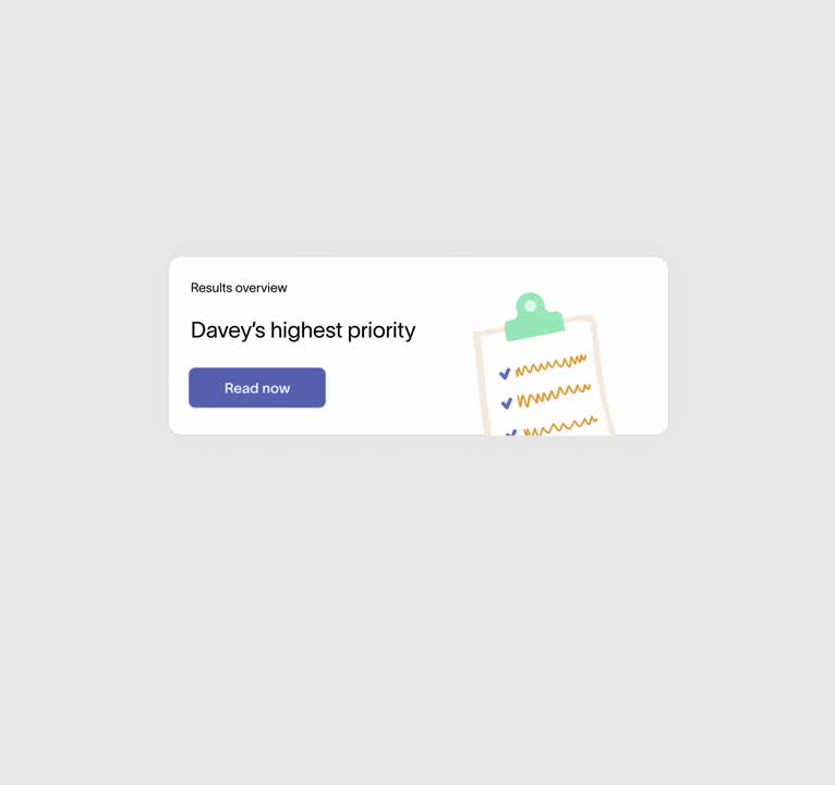
One score to rule them all

Expanded note
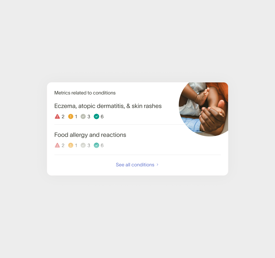
New Conditions feature
Impact
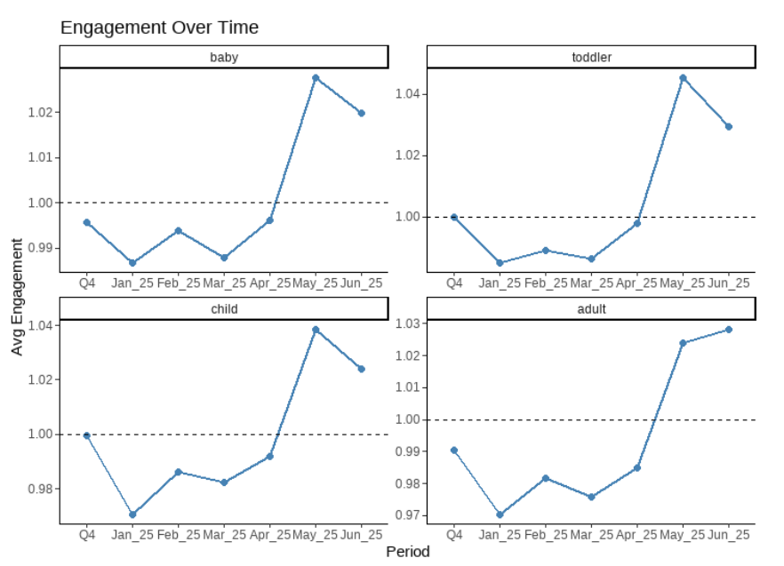
We saw an immediate change in user behavior post-launch.
↑10 pp
in promoter share (NPS)
↑30%
in engagement metrics
5 ⭐
Qualitative user feedback
Measures
NPS: ↑10 pp
Sentiment analysis showed dramatic improvements. Promoters rose from 2 out of 3 users to more than 3 out of 4. Low-score comments dropped sharply, and language became more outcome-focused, with increased mentions of "recommendations," "consultations," and feeling "empowered."
Engagement: ↑30%
Glowing feedback from users
"I find this format easier to follow, more digestible, and gives me clear answers. The previous format was more vague, more of a report that I couldn't really comprehend whereas this is digestible by a regular person in a way that makes sense. This is really great!" - Caroline, mother of baby with colic
Next: Resample rate
Over the next 6 months, we will monitor how our resample rate (users testing again with us) changes.
My learnings
This project demonstrated how thoughtful UX design can transform a complex, data-heavy product into an accessible tool that truly serves users' needs.
Takeaways
User context is everything
Understanding that 72% of users arrived with specific health concerns completely changed how information should be presented.
Less can be more
Reducing information overload increased satisfaction and engagement.
Design for the 80%
While some users wanted deep scientific detail, designing for the majority of concerned parents improved the experience for everyone.
Collaborators
Ritika Khilnani, Rebeca Gimenez, Kim Sukhum
© Annelise Hillmann