About project
For my men's acne care brand FRONTMAN, my goal was to create a male-optimized shopping flow that educated users to yield high conversion.
Cofounder / CEO (me)
Cofounder / COO
Design Engineer
Custom ecommerce flow on top of Shopify
This was my process that resulted in 33% increase in AOV and a top decile conversion rate for direct-to-consumer.
Conversion rate
Average Order Value (AOV)
Cofounder / CEO
As the creative lead for my startup, I led the design of the ecommerce experience, in addition to Marketing, Growth, and Fundraising.
Collaboration with cofounder and engineer
I worked every day with my cofounder (who led Operations and Customer Service) and our design engineer. We collaborated on this project and were able to spin out multiple iterations in a matter of hours to yield new data.
Discovery & definition
Acne care and cosmetic products were foreign to our audience.
Conducted hundreds of user interviews
Did user interviews, surveys, and competitor analysis to understand user preferences and industry benchmarks for KPIs.
Defined our scope & goals
Worked with team leads to define the goals for this project:
· Educate user at the right points in the purchase journey
· Increase conversion and AOV
Defined user personas
Created detailed user personas representing the diverse target audience. We considered factors such as age, preferences, social media usage, and technological proficiency to tailor the design to meet varying needs.
Analyzed familiar ecom experiences
Analyzed familiar shopping platforms, like Apple.com and Amazon, and other frequently used platforms, like Spotify.

Traditional ecom would not cut it
In similar ecom experiences:
- Standard product pages did little to educate the user
- Users were prompted early on to convert before education could happen
Acne care and cosmetic products were foreign to our audience
They needed to know a lot about the product itself to feel comfortable buying it.
Increasing number of our customers were not the end consumer
More moms of teenage sons were using the site. However, 70% of users were our young male target. As a result, I had to keep both user profiles in mind.
Ideation & concepting
Worked with the team to iterate on solutions.
Led whiteboarding sessions on concepts
Whiteboarded user flows that we hypothesized would better educate users and optimize for higher AOV and conversion.
Defined information architecture
Moved to Figjam for first mapping of user flows where we collaborated further.
Blocked out product pages
With the insights from our previous planning
Progressive disclosure
Unique site structure, focusing on presenting the right information at the right time in the user's journey so as not to overwhelm them (a common cause for bounce with the male users).

Initial Figjam architecture framework.

Evaluation & testing
Internal and external testing rounds
Internal and external testing rounds
Beta tested hidden Shopify pages with various device types to validate them and squash any remaining bugs before rolling out.
Long scroll idea was working
Users were engaged with the long scroll education pages and learned about the products effectively
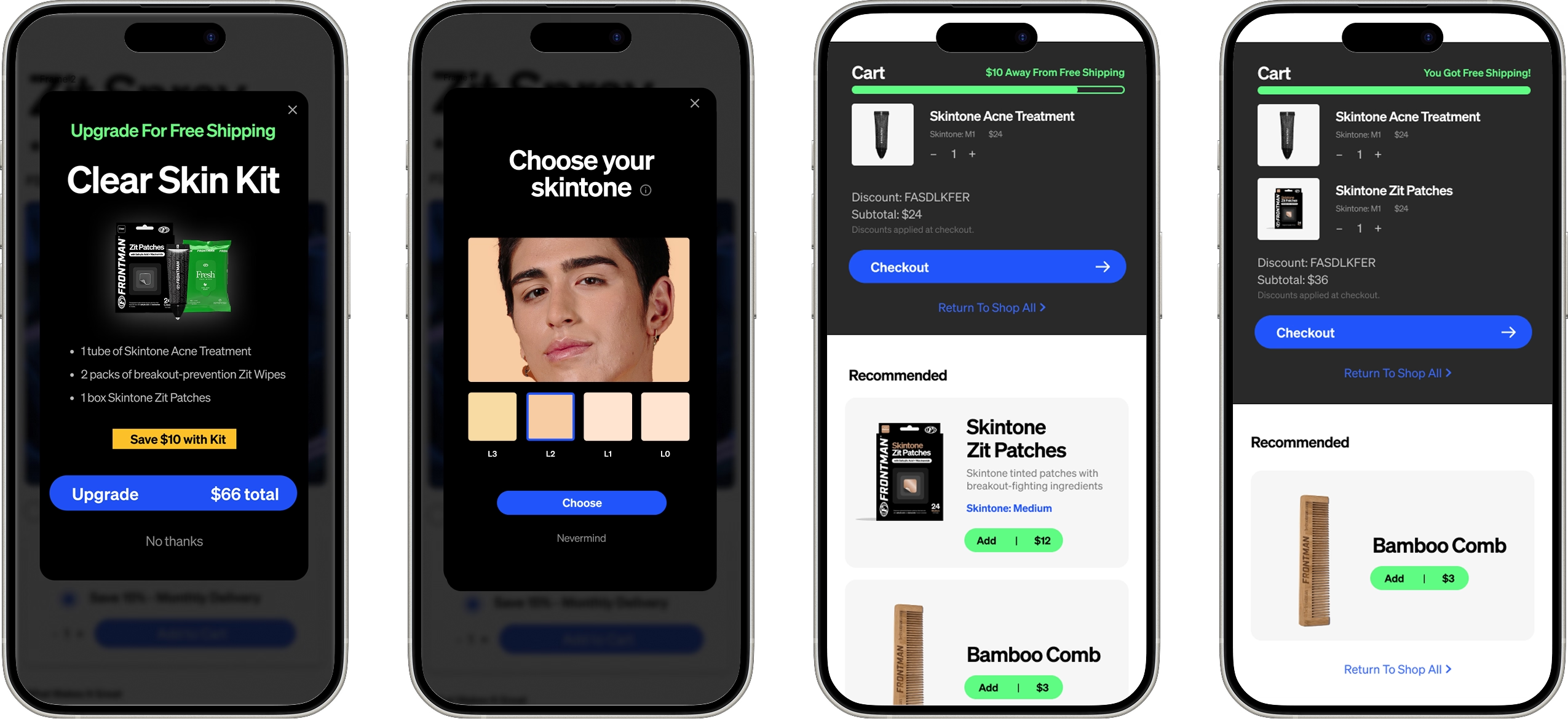
Users still had issue of knowing which shade to choose
We realized that there would still be issues for the user to understand which skintone shade would be his match.
*New feature: Shade matching
Bypassing shade matching for easy purchase.
Allowed users to checkout without a shade
Created a draft order, then customer service would reach out to the user for an image of them to match manually.
Hundreds of user images
Through this SMS conversation flow, we gathered hundreds of user images for research to understand our audience.

Unfortunately do not have an image anymore of this feature in the flow
Final designs & implementation
Cutting-edge ecommerce platform
Simple modular block layout
Modular block layout similar to Apple that could easily respond to screen sizes and clearly present information.
Sparked delight with custom animations & 3D assets
Worked in Adobe After Effects to create engaging images of product packaging & use.
Figma file with designs
Figma file containing all of the user flows, screens, edge cases, prototypes and copy needed for successful implementation.
Assisted developers with implementation
I also assisted our developer to maintain the quality of final implementation.
Final design: Long scroll education
One of the design's best features broke the cardinal rule of ecommerce: shorten the path from landing to checkout as much as possible. Counterintuitively, we added a page even before the product page where users could not purchase directly.
These educational pages had no checkout buttons, rather large mobile-friendly blocks with the product features clearly outlined. We optimized them to hold attention with user videos and gifs.
Final design: Logic-driven upsell
As the product line grew, we had to adapt the information architecture for various needs, particularly upsell for the maximum AOV. I designed a logic-driven recommendation feature that would suggest the most compatible add-ons for any product placed in the cart.


Impact
This project drove real and meaningful results for our startup, moving the needle on the most important growth metrics.
4%
CVR
(top decile for D2C)
My learnings
This project was a real lesson in iteration and constant improvement. We found that the smallest changes in UI could exponentially impact our key metrics and ecommerce success. Our team was relentless in testing new flows to optimize the experience for our users, and this is key to a successful product build.
Collaborators Nick Bunn and Patch Kroll.


.png)